Rebranding the World Business Network NEWS


Impresa Brand360 was engaged to rebrand the WBN News at a pivotal time in its growth. With new services on the horizon, the organization needed to evolve its visual identity and brand architecture to reflect its ambitions and professional trajectory.
Challenge One: The Name
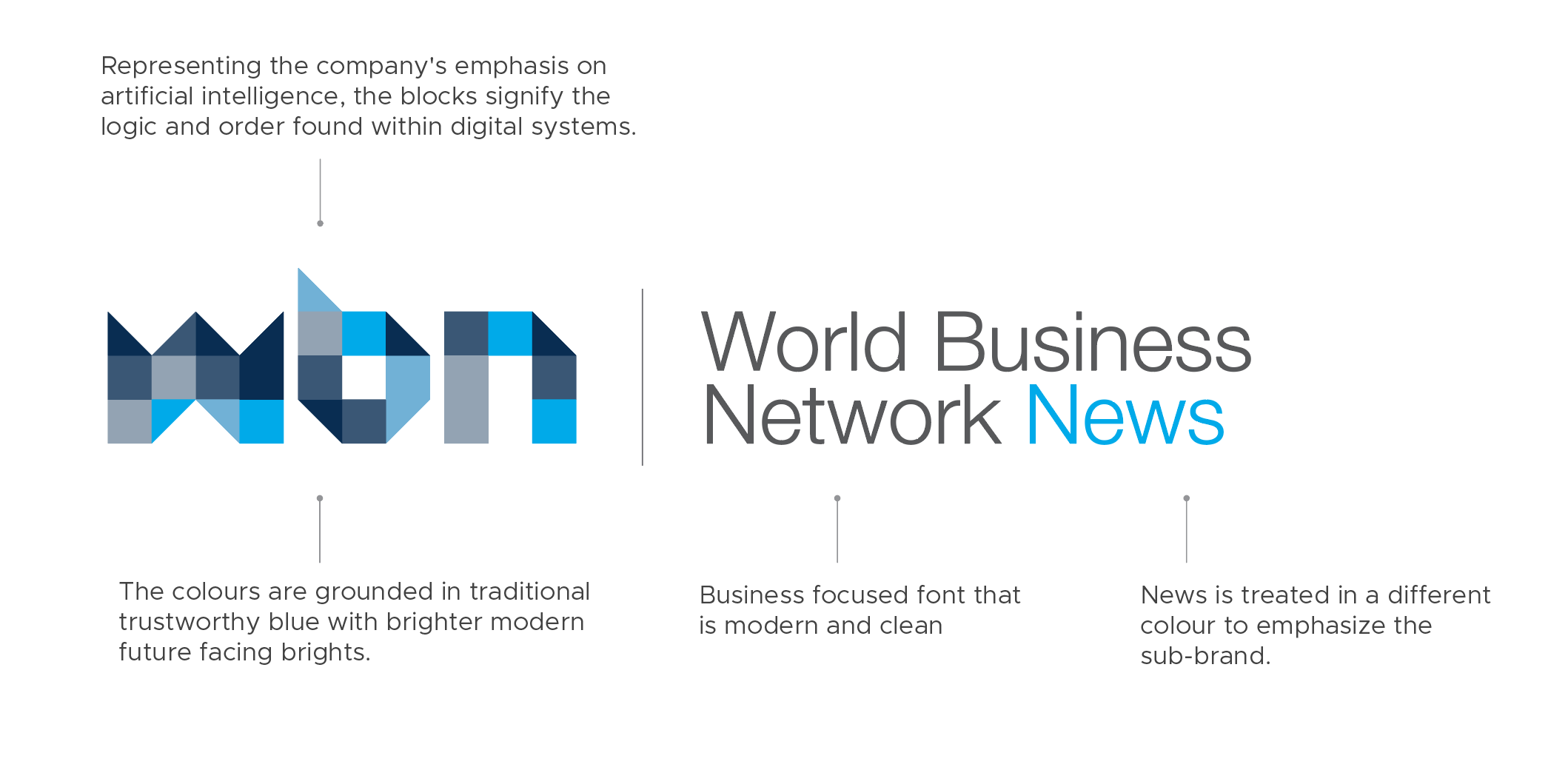
The first challenge was the acronym: WBN. Acronyms can often hinder clarity. They rarely carry inherent meaning and typically don’t communicate a brand's purpose, personality, or values. This makes it difficult for audiences to emotionally connect with the brand or recall it easily.
While acronyms like those used in law or architecture firms may make sense internally or historically (normally names of past and current partners), they often hold little relevance for the outside world. However, WBN stands for World Business Network—a name that is inherently rich and intriguing. This became a foundational insight. We decided to lead with the full name in all external communications, while still retaining “WBN” as a visual shorthand—a supporting icon. After all, people naturally shorten names, and by the time they abbreviate it, they’ll already know what WBN represents.

Challenge Two: Brand Architecture
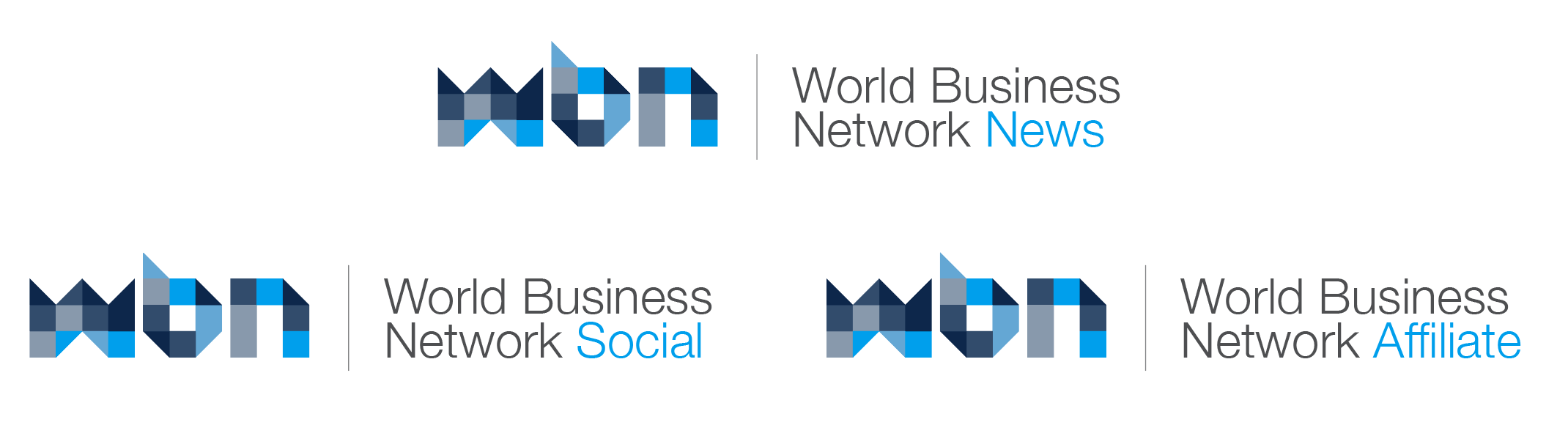
Next came brand architecture—the structure that defines how the company’s core brand and future offerings relate to one another. With upcoming services like a social platform and an affiliate program, we had to determine whether each would take on a distinct identity or fall under a unified system.
Given the company’s early-stage growth, we recommended a cohesive brand family. Keeping a consistent look and feel builds trust and familiarity. It also helps customers more easily navigate and engage with new services as they launch, reinforcing a strong and unified brand presence.
Challenge Three: Logo Extensions
To support internal communications, we developed abbreviated versions of the logo for use in internal tools such as newsletters, Slack channels, and Basecamp. These simplified icons are functional and scalable across various internal touchpoints.
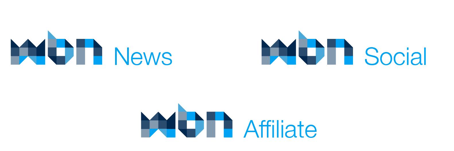
In public-facing contexts—particularly social media—these icons can also be used, provided they are always paired with the full company name. Ideally, the full logo (horizontal or stacked) appears in header graphics to maintain clarity and recognition.

Challenge Four: Visual Design
All of the above strategic choices laid the groundwork for design. With clear brand goals and architecture in place, we developed a flexible visual identity that balances professionalism with a modern, tech-forward aesthetic.
The final logo and icon system went through multiple iterations, refining it to be both versatile and recognizable. We also developed a system of visual patterns—extending the square motif from the logo into graphic applications. These patterns serve a functional purpose as well, providing areas for content while enhancing visual continuity.

Now It’s Time to Let the Brand Live and Grow
With the foundation laid and the visual identity established, the next chapter begins. A brand is not static; it evolves with the people who use it, the markets it serves, and the stories it tells. The World Business Network now has the clarity, flexibility, and confidence to move forward—and grow into its full potential. It’s time to put the brand into the world, let it breathe, and watch it build meaningful connections with every interaction.