The Story Behind the Green Highway Signs We See Everywhere
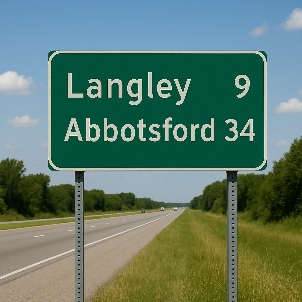
In the early days of road travel, there was no standardized system for road signs. By 1957, green-and-white signage was formally adopted for use on the U.S. Interstate Highway System—and similar standards quickly spread to Canada and many other countries. Let's talk about it.